Hello guys, Today another blogger box to exhibit your primary messages.This box is originally made by
Pc Genie Land. The box is totally distinguishable from others.Object new writing figure.Two absolute diverse sections are introduced.As common hover effects are adscititious to it.The box is made to add paragraphs unitedly.So if you be productive and use this box , your diary could informant few sincere reciprocation. So let's get started
Live Demo
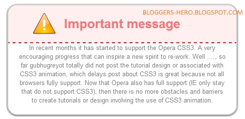
Important message
In recent months it has started to support the Opera CSS3. A very encouraging progress that can inspire a new spirit to re-work. Well ...., so far gubhugreyot totally did not post the tutorial design or associated with CSS3 animation, which delays post about CSS3 is great because not all browsers fully support. Now that Opera also has full support (IE only stay that do not support CSS3), then there is no more obstacles and barriers to create tutorials or design involving the use of CSS3 animation. To start a post about CSS3 animation, we will create a rainbow effect on the Adding Message Box To Blogger
- Go To Blogger
- Template > Edit Html > Proceed
- Search for ]]></b:skin>
.BHbox{
text-align:center;
width:75%;
background-color:#fff;
color:#7F7F7F;
padding:20px;
border:2px solid #ccc;
-moz-border-radius: 20px;
-webkit-border-radius:20px;
-khtml-border-radius:20px;
-moz-box-shadow: 0 1px 5px #333;
-webkit-box-shadow: 0 1px 5px #333;
z-index:101;
}
.BHbox:hover{
color:#333;
box-shadow: 0 0 10px 12px rgba(0,0,0,.35);
}
.BHbox h1{
border-bottom: 2px dashed #fa0a0a;
margin:-20px -20px 0px -20px;
padding:20px;
background-color:#FFEFEF;
color:#EF7777;
-moz-border-radius:20px 20px 0px 0px;
-webkit-border-top-left-radius: 20px;
-webkit-border-top-right-radius: 20px;
-khtml-border-top-left-radius: 20px;
-khtml-border-top-right-radius: 20px;
background-image: url('http://findicons.com/files/icons/2146/realistik_reloaded/48/error.png');
background-repeat: no-repeat;
background-position: 50px center;
}
.BHbox h1:hover{
color:#ff0088;
}
Implementing The Box
- Use the following code to use the box in your blog posts
<div align="center">
<div class="BHbox" id="BHbox" style="display: block;">
<h1>
Important message</h1>
In recent months it has started to support the Opera CSS3. A very encouraging progress that can inspire a new spirit to re-work. Well ...., so far gubhugreyot totally did not post the tutorial design or associated with CSS3 animation, which delays post about CSS3 is great because not all browsers fully support. Now that Opera also has full support (IE only stay that do not support CSS3), then there is no more obstacles and barriers to create tutorials or design involving the use of CSS3 animation. To start a post about CSS3 animation, we will create a rainbow effect on the
</div>
</div>
</div>
- Replace the text in pink with your own text.
Message From the Editor Disk
- The box is bendable and can touch any quantity of book in it.If you someone any problems in using this box , openhearted use lens us or note below.Paradisiac Blogging:)
- Now If You Enjoy This Post! Please Take 5 Seconds To Share It.


0 comments: